This is Roefl's pixeling guide. This was the guide that really got me interested in pixel art, and I think it's an excellent starting point for any pixel artist.
I did not create and do not own this guide. It is the sole property of Roefl.
I will start off by telling you how to make the outlines for the Endless Online sprites.
Maybe you've noticed the sprites in Endless Online (or any private server) are Isometric. Isometric means that the sprite is sort of "diagonal" on your screen, like it has been rotated by 120 degrees. Anyway, the reason why it's isometric is so it will look more like a 3 Dimensional environment. Just take a look at this sprite.

I've seen a lot of people making armors/robes/skirts, but what they don't realize is they're not making it isometric.
Let me show you an example.
Oyesh, look what I made. Sexy, right?
Well you should notice it isn't shaded properly, we'll get to that later.
Also it doesn't really look good either, one criticism on that would be that it's not isometric.
Now let me show you the isometric one.

Aaah! That's better, don't you agree? Guess I've got to show you how and what I did exactly. Well, I simply followed the body lines. Even though it's a sprite you have to look at it as it is real.

No, WHAT!? Im not a perv... seriously...
Anyway, I colored the leg in front blue and the one in the back red.
Let's say you're the female standing there, and you're wearing a skirt.
How would it look if you make it on a sprite? Yes indeed, it would look like that.
Not in one line like ________ because if you look at the feet and their position on the floor, one foot is placed higher then the other.
Another thing, outlines should be darker then the inside so it blends into the background.
Some people don't notice that you can use the outline to shade too. Just don't use that too much though.
Next up is shading.

Let me show you the basics of the shading in pixel art.
First off you've probably heard that "pillow" shading is the bad way to shade your armors/weapons.
It's true! (NOOOoOOoo!) It'll make your creation look like a pillow, just like this.

A way to prevent this is to picture a sun or light source in the upper-left corner of the screen. Picture that the light is shining on your creation from that spot. Means you should get something like this.

Event though that doesn't really look good, we should make the sun/lightsource a bit brighter, and add more contrast between the colours. Now check the picture.

Ok, now we're getting to the hard part. This is about the Dithering. Yes, dithering.
This is probably one of the hardest parts of shading, you shouldnt abuse the dithering technique.
Now let me explain what dithering does.
Pixel art is known as art with just a few colours. You can create an illusion to the eye by putting 2 different colors next to each other like a checkboard.
It will look like a gradient and create a 3rd color, look at the image.

Ok, the last thing I want to say about the shading is that EVERYTHING has glossiness. This means you should really think about the contrast of the objects. For instance; Polished metal really has to shine! Look at the image: 1st = Metal and the 2nd = Snowball.

Now we've had the basics of outlining and the right way of shading we should make something. Ok, let's make a simple armor for the male character. First we need a Sprite Sheet, which can be found here. Now we should draw the outlines, making sure it looks isometric. Personally I like making them red or blue. The reason I do that, is that I don't mix the outlines with the background and/or character. Ok, here's my outline.

Ok, now we have that down we should start by coloring the armors inside.
I always do the shoulder plates first, Notice where the light source is shining from.
(I put arrows there to make sure you'll notice).

Ok, now the coloring the rest, and adding some highlights.

After we got the basic shading down, we can add the darker shade and of course fix the rest. Make sure you'll shade it as a real armor, it has to be shiny!

It looks hard, but if you practice a bit it's very easy. (I rushed the plate)
Still I don't really like it, let's add a trim and maybe a cape.
There we go, if I'd count the colours used.. It would be around 13 unique colours.

NOTE: This is a tutorial plate I made, used to show how to make it. This is not my best work, I just wanted to say that. Oh, and maybe you noticed the character sprite I used is different then yours. That's because this was the custom shaded sprite I made for FE.
Next I'm going to show you how to make a npc. First off we start with the outlines again. BEWARE! The hardest thing is to make it ISOMETRIC. In the past I've had a lot of failures with the isometric-ness of the npc. Well, to help you should draw 2 lines like this. After you did that, you should make the npc (make sure that the right side is higher then the left.)

Ok now we got that down, this is always the hardest part of npc-ing. After that we should highlight where the shades should be, kinda like we did at the armour. I also added the legs this time, Oh you noticed it's an ant! Not just any ant, it's DA QUEEN. Anyway, while we got that down we should choose the correct colours to shade it. Let's google an ant, and look at those colours. Aaah, here we go.

Ahh, it looks good don't you think so? Well, let's make the outlines of the back part a bit lighter and shade the legs properly. Make sure you shade like I taught you before.

Tadaaa, done is our ant queen.

Let's make a sword. As you know, a sword isn't completely flat. So let's draw the outlines, and keep in mind it isnt flat! (Look at the right corner.)
Ok, as you see I drew a line in the middle. This is the point where we have to shade. So the next thing we'll do is highlight the shading areas. It'll be easy shading and adding detail after. Ok, let's do it.
This was just using the paintbucket tool, nothing hard about it. Notice how you can shade the outline, It's really neccesary to do that with a weapon to make it look sharp. Let's add the rest of the shading.
That looks better doesn't it? I added some slightly lighter shadings to add the "metal effect". This is what you really should remember, it could also be used for armours/shields etc. Well that was our sword, I suggest you copy/paste it to look at it up close!
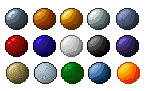
So, now we got that down, I'll show you some "materials" or a "palette" you could use. I made it circles so I'll be able to show what material should be, like dithered or not.
First row: Iron,
Copper,
Gold,
Silve,r
Old iron/steel (notice the colour difference, It's not as glossy).
Second row: Red plastic,
Blue plastic,
White fabric material (cloth,)
Black fabric material (cloth,)
Purple/blue plastic
Third row: Desert sand/rock,
Snow,
Grass,
Ice,
Lava
Those are some of the basic colours you should use, but you should learn yourself how to choose/pick colours.
As an example, I'll show you how I used to shade yellow and, of course, how I do now.
The yellow-> green one was just by sliding the black-white bar darker which makes it green.
While you should add a bit red to make it orange and make the yellow shading look way better (unless you want it to be green.)
Other thing's you should watch is that you don't make the colors too bright/saturated like some people like to do with green/red/yellow/blue.
It makes it unrealistic and bad so you have to mess around with the grey-scale a bit to fix that.

Other things you should remember: Always save as PNG/GIF/BMP, but PNG is the standard. (JPG IS BAD BAD BAD BAD.). You can also shade the outlines (but that is for your own taste). Take your time and don't rush it like me! Take reference pictures, but do NOT copy & paste or RECOLOR, this is not considered as YOUR art. Thank you for reading, and good luck.